The UIManager provides a way to create menus and toolbars from an XML-like description. The UIManager uses ActionGroup objects to manage the Action objects providing the common substructure for the menu and toolbar items.
Using the UIManager you can dynamically merge and demerge multiple UI descriptions and actions. This allows you to modify the menus and toolbars when the mode changes in the application (for example, changing from text editing to image editing), or when new plug-in features are added or removed from your application.
A UIManager can be used to create the menus and toolbars for an application user interface as follows:
- Create a UIManager instance
- Extract the AccelGroup from the UIManager and add it to the top level Window
- Create the ActionGroup instances and populate them with the appropriate Action instances.
- Add the ActionGroup instances to the UIManager in the order that the Action instances should be found.
- Add the UI XML descriptions to the UIManager. Make sure that all Actions referenced by the descriptions are available in the UIManager ActionGroup instances.
- Extract references to the menubar, menu and toolbar widgets by name for use in building the user interface.
- Dynamically modify the user interface by adding and removing UI descriptions and by adding, rearranging and removing the associated ActionGroup instances.
A UIManager instance is created by the constructor:
uimamager = gtk.UIManager() |
A new UIManager is created with an associated AccelGroup that can be retrieved using the method:
accelgroup = uimanager.get_accel_group() |
The AccelGroup should be added to the top level window of the application so that the Action accelerators can be used by your users. For example:
window = gtk.Window() ... uimanager = gtk.UIManager() accelgroup = uimanager.get_accel_group() window.add_accel_group(accelgroup) |
As described in Section 16.1.2, “ActionGroups”, ActionGroups can be populated with Actions by using the add_actions(), add_toggle_actions() and add_radio_actions() convenience methods. An ActionGroup can be used by a UIManager after it has been added to its ActionGroup list by using the method:
uimanager.insert_action_group(action_group, pos) |
where pos is the index of the position where action_group should be inserted. A UIManager may contain several ActionGroups with duplicate Action names. The order of the ActionGroup objects is important because the lookup of an Action stops when the first Action with the given name is encountered. This means that actions in earlier ActionGroup objects mask those in later ActionGroup objects.
The actions referenced in a UI XML description must be added to a UIManager before the description can be added to the UIManager.
An ActionGroup can be removed from a UIManager by using the method:
uimanager.remove_action_group(action_group) |
A list of the ActionGroup objects associated with a UIManager can be retrieved using the method:
actiongrouplist = uimanager.get_action_groups() |
The UI descriptions accepted by UIManager are simple XML definitions with the following elements:
| ui | The root element of a UI description. It can be omitted. Can contain menubar, popup, toolbar and accelerator elements. |
| menubar | A top level element describing a MenuBar structure that can contain MenuItem, separator, placeholder and menu elements. It has an optional name attribute. If name is not specified, "menubar" is used as the name. |
| popup | A top level element describing a popup Menu structure that can contain menuitem, separator, placeholder, and menu elements. It has an optional name attribute. If name is not specified, "popup" is used as the name. |
| toolbar | A top level element describing a Toolbar structure that can contain toolitem, separator and placeholder elements. It has an optional name attribute. If name is not specified, "toolbar" is used as the name. |
| placeholder | An element identifying a position in a menubar, toolbar, popup or menu. A placeholder can contain menuitem, separator, placeholder, and menu elements. Placeholder elements are used when merging UI descriptions to allow, for example, a menu to be built up from UI descriptions using common placeholder names. It has an optional name attribute. If name is not specified, "placeholder" is used as the name. |
| menu | An element describing a Menu structure that can contain menuitem, separator, placeholder, and menu elements. A menu element has a required attribute action that names an Action object to be used to create the Menu. It also has optional name and position attributes. If name is not specified, the action name is used as the name. The position attribute can have either the value "top" or "bottom" with "bottom" the default if position is not specified. |
| menuitem | An element describing a MenuItem. A menuitem element has a required attribute action that names an Action object to be used to create the MenuItem. It also has optional name and position attributes. If name is not specified, the action name is used as the name. The position attribute can have either the value "top" or "bottom" with "bottom" the default if position is not specified. |
| toolitem | An element describing a toolbar ToolItem. A toolitem element has a required attribute action that names an Action object to be used to create the Toolbar. It also has optional name and position attributes. If name is not specified, the action name is used as the name. The position attribute can have either the value "top" or "bottom" with "bottom" the default if position is not specified. |
| separator | An element describing a SeparatorMenuItem or a SeparatorToolItem as appropriate. |
| accelerator | An element describing a keyboard accelerator. An accelerator element has a required attribute action that names an Action object that defines the accelerator key combination and is activated by the accelerator. It also has an optional name attribute. If name is not specified, the action name is used as the name. |
For example, a UI description that could be used to create an interface similar that in Figure 16.4, “ActionGroup Example” is:
  <ui>
    <menubar name="MenuBar">
      <menu action="File">
        <menuitem action="Quit"/>
      </menu>
      <menu action="Sound">
        <menuitem action="Mute"/>
      </menu>
      <menu action="RadioBand">
        <menuitem action="AM"/>
        <menuitem action="FM"/>
        <menuitem action="SSB"/>
      </menu>
    </menubar>
    <toolbar name="Toolbar">
      <toolitem action="Quit"/>
      <separator/>
      <toolitem action="Mute"/>
      <separator name="sep1"/>
      <placeholder name="RadioBandItems">
        <toolitem action="AM"/>
        <toolitem action="FM"/>
        <toolitem action="SSB"/>
      </placeholder>
    </toolbar>
  </ui>
|
Note that this description just uses the action attribute names for the names of most elements rather than specifying name attributes. Also I would recommend not specifying the ui element as it appears to be unnecessary.
The widget hierarchy created using a UI description is very similar to the XML element hierarchy except that placeholder elements are merged into their parents.
A widget in the hierarchy created by a UI description can be accessed using its path which is composed of the name of the widget element and its ancestor elements joined by slash ("/") characters. For example using the above description the following are valid widget paths:
/MenuBar /MenuBar/File/Quit /MenuBar/RadioBand/SSB /Toolbar/Mute /Toolbar/RadioBandItems/FM |
Note that the placeholder name must be included in the path. Usually you just access the top level widgets (for example, "/MenuBar" and "/Toolbar") but you may need to access a lower level widget to, for example, change a property.
Once a UIManager is set up with an ActionGroup a UI description can be added and merged with the existing UI by using one of the following methods:
merge_id = uimanager.add_ui_from_string(buffer) merge_id = uimanager.add_ui_from_file(filename) |
where buffer is a string containing a UI description and filename is the file containing a UI description. Both methods return a merge_id which is a unique integer value. If the method fails, the GError exception is raised. The merge_id can be used to remove the UI description from the UIManager by using the method:
uimanager.remove_ui(merge_id) |
The same methods can be used more than once to add additional UI descriptions that will be merged to provide a combined XML UI description. Merged UIs will be discussed in more detail in Section 16.7.8, “Merging UI Descriptions” section.
A single UI element can be added to the current UI description by using the method:
uimanager.add_ui(merge_id, path, name, action, type, top) |
where merge_id is a unique integer value, path is the path where the new element should be added, action is the name of an Action or None to add a separator, type is the element type to be added and top is a boolean value. If top is TRUE the element will be added before its siblings, otherwise it is added after.
merge_id should be obtained from the method:
merge_id = uimanager.new_merge_id() |
The integer values returned from the new_merge_id() method are monotonically increasing.
path is a string composed of the name of the element and the names of its ancestor elements separated by slash ("/") characters but not including the optional root node "/ui". For example, "/MenuBar/RadioBand" is the path of the menu element named "RadioBand" in the following UI description:
  <menubar name="MenuBar">
    <menu action="RadioBand">
    </menu>
  </menubar>
|
The value of type must be one of:
| gtk.UI_MANAGER_AUTO | The type of the UI element (menuitem, toolitem or separator) is set according to the context. |
| gtk.UI_MANAGER_MENUBAR | A menubar. |
| gtk.UI_MANAGER_MENU | A menu. |
| gtk.UI_MANAGER_TOOLBAR | A toolbar. |
| gtk.UI_MANAGER_PLACEHOLDER | A placeholder. |
| gtk.UI_MANAGER_POPUP | A popup menu. |
| gtk.UI_MANAGER_MENUITEM | A menuitem. |
| gtk.UI_MANAGER_TOOLITEM | A toolitem. |
| gtk.UI_MANAGER_SEPARATOR | A separator. |
| gtk.UI_MANAGER_ACCELERATOR | An accelerator. |
add_ui() fails silently if the element is not added. Using add_ui() is so low level that you should always try to use the convenience methods add_ui_from_string() and add_ui_from_file() instead.
Adding a UI description or element causes the widget hierarchy to be updated in an idle function. You can make sure that the widget hierarchy has been updated before accessing it by calling the method:
uimanager.ensure_update() |
You access a widget in the UI widget hierarchy by using the method:
widget = uimanager.get_widget(path) |
where path is a string containing the name of the widget element and it's ancestors as described in Section 16.7.4, “UI Descriptions”.
For example, given the following UI description:
  <menubar name="MenuBar">
    <menu action="File">
      <menuitem action="Quit"/>
    </menu>
    <menu action="Sound">
      <menuitem action="Mute"/>
    </menu>
    <menu action="RadioBand">
      <menuitem action="AM"/>
      <menuitem action="FM"/>
      <menuitem action="SSB"/>
    </menu>
  </menubar>
  <toolbar name="Toolbar">
    <toolitem action="Quit"/>
    <separator/>
    <toolitem action="Mute"/>
    <separator name="sep1"/>
    <placeholder name="RadioBandItems">
      <toolitem action="AM"/>
      <toolitem action="FM"/>
      <toolitem action="SSB"/>
    </placeholder>
  </toolbar>
|
added to the UIManager uimanager, you can access the MenuBar and Toolbar for use in an application Window by using the following code fragment:
  window = gtk.Window()
  vbox = gtk.VBox()
  menubar = uimanager.get_widget('/MenuBar')
  toolbar = uimanager.get_widget('/Toolbar')
  vbox.pack_start(meunbar, False)
  vbox.pack_start(toolbar, False)
|
Likewise the lower level widgets in the hierarchy are accessed by using their paths. For example the RadioToolButton named "SSB" is accessed as follows:
ssb = uimanager.get_widget('/Toolbar/RadioBandItems/SSB')
|
As a convenience all the top level widgets of a type can be retrieved using the method:
toplevels = uimanager.get_toplevels(type) |
where type specifies the type of widgets to return using a combination of the flags: gtk.UI_MANAGER_MENUBAR, gtk.UI_MANAGER_TOOLBAR and gtk.UI_MANAGER_POPUP. You can use the gtk.Widget.get_name() method to determine which top level widget you have.
You can retrieve the Action that is used by the proxy widget associated with a UI element by using the method:
action = uimanager_get_action(path) |
where path is a string containing the path to a UI element in uimanager. If the element has no associated Action, None is returned.
A simple example program illustrating the use of UIManager is uimanager.py. Figure 16.13, “Simple UIManager Example” illustrates the program in operation.
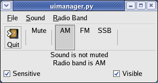
The uimanager.py example program uses the XML description of Section 16.7.6, “Accessing UI Widgets”. The text of the two labels are changed in response to the activation of the "Mute" ToggleAction and "AM", "FM" and "SSB" RadioActions. All the actions are contained in a single ActionGroup allowing the sensitivity and visibility of all the action proxy widgets to be toggled on and off by using the "Sensitive" and "Visible" toggle buttons. The use of the placeholder element will be described in Section 16.7.8, “Merging UI Descriptions”.
The merging of UI descriptions is done based on the name of the XML elements. As noted above the individual elements in the hierarchy can be accessed using a pathname consisting of the element name and the names of its ancestors. For example, using the UI description in Section 16.7.4, “UI Descriptions” the "AM" toolitem element has the pathname "/Toolbar/RadioBandItems/AM" while the "FM" menuitem element has the pathname "/MenuBar/RadioBand/FM".
If a UI description is merged with that UI description the elements are added as siblings to the existing elements. For example, if the UI description:
  <menubar name="MenuBar">
    <menu action="File">
      <menuitem action="Save" position="top"/>
      <menuitem action="New" position="top"/>
    </menu>
    <menu action="Sound">
      <menuitem action="Loudness"/>
    </menu>
    <menu action="RadioBand">
      <menuitem action="CB"/>
      <menuitem action="Shortwave"/>
    </menu>
  </menubar>
  <toolbar name="Toolbar">
    <toolitem action="Save" position="top"/>
    <toolitem action="New" position="top"/>
    <separator/>
    <toolitem action="Loudness"/>
    <separator/>
    <placeholder name="RadioBandItems">
      <toolitem action="CB"/>
      <toolitem action="Shortwave"/>
    </placeholder>
  </toolbar>
|
is added to our example UI description:
  <menubar name="MenuBar">
    <menu action="File">
      <menuitem action="Quit"/>
    </menu>
    <menu action="Sound">
      <menuitem action="Mute"/>
    </menu>
    <menu action="RadioBand">
      <menuitem action="AM"/>
      <menuitem action="FM"/>
      <menuitem action="SSB"/>
    </menu>
  </menubar>
  <toolbar name="Toolbar">
    <toolitem action="Quit"/>
    <separator/>
    <toolitem action="Mute"/>
    <separator name="sep1"/>
    <placeholder name="RadioBandItems">
      <toolitem action="AM"/>
      <toolitem action="FM"/>
      <toolitem action="SSB"/>
    </placeholder>
  </toolbar>
|
the following merged UI description will be created:
  <menubar name="MenuBar">
    <menu name="File" action="File">
      <menuitem name="New" action="New"/>
      <menuitem name="Save" action="Save"/>
      <menuitem name="Quit" action="Quit"/>
    </menu>
    <menu name="Sound" action="Sound">
      <menuitem name="Mute" action="Mute"/>
      <menuitem name="Loudness" action="Loudness"/>
    </menu>
    <menu name="RadioBand" action="RadioBand">
      <menuitem name="AM" action="AM"/>
      <menuitem name="FM" action="FM"/>
      <menuitem name="SSB" action="SSB"/>
      <menuitem name="CB" action="CB"/>
      <menuitem name="Shortwave" action="Shortwave"/>
    </menu>
  </menubar>
  <toolbar name="Toolbar">
    <toolitem name="New" action="New"/>
    <toolitem name="Save" action="Save"/>
    <toolitem name="Quit" action="Quit"/>
    <separator/>
    <toolitem name="Mute" action="Mute"/>
    <separator name="sep1"/>
    <placeholder name="RadioBandItems">
      <toolitem name="AM" action="AM"/>
      <toolitem name="FM" action="FM"/>
      <toolitem name="SSB" action="SSB"/>
      <toolitem name="CB" action="CB"/>
      <toolitem name="Shortwave" action="Shortwave"/>
    </placeholder>
    <separator/>
    <toolitem name="Loudness" action="Loudness"/>
    <separator/>
  </toolbar>
|
Examining the merged XML you can see that the "New" and "Save" menuitem elements have been merged before the "Quit" element as a result of the "position" attribute being set to "top" which means the element should be prepended. Likewise, the "New" and "Save" toolitem elements have been prepended to "Toolbar". Note that the "New" and "Save" elements are reversed by the merging process.
The "Loudness" toolitem element is appended to the "Toolbar" elements and appears last in the merged UI description even though it's not last in its UI description. The "RadioBandItems" placeholder element in both UI descriptions combines the "CB" and "Shortwave" toolitem elements with the "AM", "FM", and "SSB" elements. If the "RadioBandItems" placeholder element was not used the "CB" and "Shortwave" elements would have been placed after the "Loudness" element.
A representation of the UI description used by a UIManager can be retrieved using the method:
uidesc = uimanager.get_ui() |
The uimerge.py example program demonstrates the merging of the above UI descriptions. Figure 16.14, “UIMerge Example” illustrates the unmerged and merged UIs:
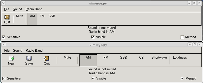
The example program uses three ActionGroup objects:
- Action objects for the "File", "Sound" and "Radio Band" menus
- Action objects for the "Quit", "Mute", "AM", "FM", "SSB" and "Radio Band" menus
- Action objects for the "Loudness", "CB" and "Shortwave" elements
The "Sensitive" and Visible" ToggleButton widgets control the sensitivity and visibility of only the second ActionGroup.
The UIManager has a couple of interesting signals that your application can connect to. The "actions-changed" signal is emitted when an ActionGroup is added or removed from a UIManager. The signature of the callback is:
def callback(uimanager, ...) |
The "add-widget" signal is emitted when a proxy MenuBar or Toolbar widget is created. The callback signature is:
def callback(uimanager, widget, ...) |
where widget is the newly created widget.