Toolbars are usually used to group some number of widgets in order to simplify customization of their look and layout. Typically a toolbar consists of buttons with icons, labels and tooltips, but any other widget can also be put inside a toolbar. Finally, items can be arranged horizontally or vertically and buttons can be displayed with icons, labels, or both.
Creating a toolbar is (as one may already suspect) done with the following function:
toolbar = gtk.Toolbar() |
After creating a toolbar one can append, prepend and insert items (that means simple text strings) or elements (that means any widget types) into the toolbar. To describe an item we need a label text, a tooltip text, a private tooltip text, an icon for the button and a callback for it. For example, to append or prepend an item you may use the following methods:
toolbar.append_item(text, tooltip_text, tooltip_private_text, icon, callback, user_data=None) toolbar.prepend_item(text, tooltip_text, tooltip_private_text, icon, callback, user_data) |
If you want to use the insert_item() method, the only additional parameter which must be specified is the position in which the item should be inserted, thus:
  toolbar.insert_item(text, tooltip_text, tooltip_private_text, icon, callback,
                      user_data, position)
|
To simplify adding spaces between toolbar items, you may use the following methods:
toolbar.append_space() toolbar.prepend_space() toolbar.insert_space(position) |
If it's required, the orientation of a toolbar, its style and whether tooltips are available can be changed "on the fly" using the following methods:
toolbar.set_orientation(orientation) toolbar.set_style(style) toolbar.set_tooltips(enable) |
Where orientation is one of ORIENTATION_HORIZONTAL or ORIENTATION_VERTICAL. The style is used to set appearance of the toolbar items by using one of TOOLBAR_ICONS, TOOLBAR_TEXT, or TOOLBAR_BOTH. The enable argument is either TRUE or FALSE.
To show some other things that can be done with a toolbar, let's take the toolbar.py example program (we'll interrupt the listing with some additional explanations):
    1   #!/usr/bin/env python
    2
    3   # example toolbar.py
    4
    5   import pygtk
    6   pygtk.require('2.0')
    7   import gtk
    8
    9   class ToolbarExample:
   10       # This method is connected to the Close button or
   11       # closing the window from the WM
   12       def delete_event(self, widget, event=None):
   13           gtk.main_quit()
   14           return False
   15
|
The above beginning seems should be familiar to you if it's not your first PyGTK program. There is one additional thing though, we import a nice XPM picture (gtk.xpm)to serve as an icon for all of the buttons. Line 10 starts the ToolbarExample class and lines 12-14 define the callback method which will terminate the program.
16 # that's easy... when one of the buttons is toggled, we just 17 # check which one is active and set the style of the toolbar 18 # accordingly 19 def radio_event(self, widget, toolbar): 20 if self.text_button.get_active(): 21 toolbar.set_style(gtk.TOOLBAR_TEXT) 22 elif self.icon_button.get_active(): 23 toolbar.set_style(gtk.TOOLBAR_ICONS) 24 elif self.both_button.get_active(): 25 toolbar.set_style(gtk.TOOLBAR_BOTH) 26 27 # even easier, just check given toggle button and enable/disable 28 # tooltips 29 def toggle_event(self, widget, toolbar): 30 toolbar.set_tooltips(widget.get_active()) 31 |
Lines 19-30 are two callback methods that will be called when one of the buttons on a toolbar is pressed. You should already be familiar with things like this if you've already used toggle buttons (and radio buttons).
   32       def __init__(self):
   33           # Here is our main window (a dialog) and a handle for the handlebox
   34           # Ok, we need a toolbar, an icon with a mask (one for all of
   35           # the buttons) and an icon widget to put this icon in (but
   36           # we'll create a separate widget for each button)
   37           # create a new window with a given title, and nice size
   38           dialog = gtk.Dialog()
   39           dialog.set_title("GTKToolbar Tutorial")
   40           dialog.set_size_request(450, 250)
   41           dialog.set_resizable(True)
   42
   43           # typically we quit if someone tries to close us
   44           dialog.connect("delete_event", self.delete_event)
   45
   46           # to make it nice we'll put the toolbar into the handle box,
   47           # so that it can be detached from the main window
   48           handlebox = gtk.HandleBox()
   49           dialog.vbox.pack_start(handlebox, False, False, 5)
   50
|
The above should be similar to any other PyGTK application. Just initialization of a ToolbarExample object instance creating the window, etc. There is only one thing that probably needs some explanation: a handle box. A handle box is just another box that can be used to pack widgets in to. The difference between it and typical boxes is that it can be detached from a parent window (or, in fact, the handle box remains in the parent, but it is reduced to a very small rectangle, while all of its contents are reparented to a new freely floating window). It is usually nice to have a detachable toolbar, so these two widgets occur together quite often.
51 # toolbar will be horizontal, with both icons and text, and 52 # with 5pxl spaces between items and finally, 53 # we'll also put it into our handlebox 54 toolbar = gtk.Toolbar() 55 toolbar.set_orientation(gtk.ORIENTATION_HORIZONTAL) 56 toolbar.set_style(gtk.TOOLBAR_BOTH) 57 toolbar.set_border_width(5) 58 handlebox.add(toolbar) 59 |
Well, what we do above is just a straightforward initialization of the toolbar widget.
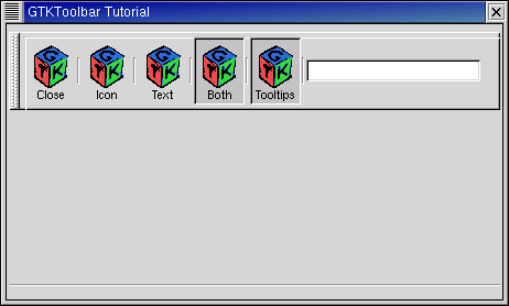
   60           # our first item is <close> button
   61           iconw = gtk.Image() # icon widget
   62           iconw.set_from_file("gtk.xpm")
   63           close_button = toolbar.append_item(
   64               "Close",           # button label
   65               "Closes this app", # this button's tooltip
   66               "Private",         # tooltip private info
   67               iconw,             # icon widget
   68               self.delete_event) # a signal
   69           toolbar.append_space() # space after item
|
In the above code you see the simplest case: adding a button to toolbar. Just before appending a new item, we have to construct an image widget to serve as an icon for this item; this step will have to be repeated for each new item. Just after the item we also add a space, so the following items will not touch each other. As you see the append_item() method returns a reference to our newly created button widget, so that we can work with it in the normal way.
   71           # now, let's make our radio buttons group...
   72           iconw = gtk.Image() # icon widget
   73           iconw.set_from_file("gtk.xpm")
   74           icon_button = toolbar.append_element(
   75               gtk.TOOLBAR_CHILD_RADIOBUTTON, # type of element
   76               None,                          # widget
   77               "Icon",                        # label
   78               "Only icons in toolbar",       # tooltip
   79               "Private",                     # tooltip private string
   80               iconw,                         # icon
   81               self.radio_event,              # signal
   82               toolbar)                       # data for signal
   83           toolbar.append_space()
   84           self.icon_button = icon_button
   85
|
Here we begin creating a radio buttons group. To do this we use the append_element() method. In fact, using this method one can also add simple items or even spaces (type = gtk.TOOLBAR_CHILD_SPACE or gtk.TOOLBAR_CHILD_BUTTON). In the above case we start creating a radio group. In creating other radio buttons for this group a reference to the previous button in the group is required, so that a list of buttons can be easily constructed (see Section 6.4, “Radio Buttons” earlier in this tutorial). We also save a reference to the button in the ToolbarExample instance for later access.
   86           # following radio buttons refer to previous ones
   87           iconw = gtk.Image() # icon widget
   88           iconw.set_from_file("gtk.xpm")
   89           text_button = toolbar.append_element(
   90               gtk.TOOLBAR_CHILD_RADIOBUTTON,
   91               icon_button,
   92               "Text",
   93               "Only texts in toolbar",
   94               "Private",
   95               iconw,
   96               self.radio_event,
   97               toolbar)
   98           toolbar.append_space()
   99           self.text_button = text_button
  100
  101           iconw = gtk.Image() # icon widget
  102           iconw.set_from_file("gtk.xpm")
  103           both_button = toolbar.append_element(
  104               gtk.TOOLBAR_CHILD_RADIOBUTTON,
  105               text_button,
  106               "Both",
  107               "Icons and text in toolbar",
  108               "Private",
  109               iconw,
  110               self.radio_event,
  111               toolbar)
  112           toolbar.append_space()
  113           self.both_button = both_button
  114           both_button.set_active(True)
  115
|
We create the other radiobuttons the same way except we pass one of the created radio group buttons to the append_element() method to specify the radio group.
In the end we have to set the state of one of the buttons manually (otherwise they all stay in active state, preventing us from switching between them).
  116           # here we have just a simple toggle button
  117           iconw = gtk.Image() # icon widget
  118           iconw.set_from_file("gtk.xpm")
  119           tooltips_button = toolbar.append_element(
  120               gtk.TOOLBAR_CHILD_TOGGLEBUTTON,
  121               None,
  122               "Tooltips",
  123               "Toolbar with or without tips",
  124               "Private",
  125               iconw,
  126               self.toggle_event,
  127               toolbar)
  128           toolbar.append_space()
  129           tooltips_button.set_active(True)
  130
|
A toggle button can be created in the obvious way (if one knows how to create radio buttons already).
131 # to pack a widget into toolbar, we only have to 132 # create it and append it with an appropriate tooltip 133 entry = gtk.Entry() 134 toolbar.append_widget(entry, "This is just an entry", "Private") 135 136 # well, it isn't created within the toolbar, so we must still show it 137 entry.show() 138 |
As you see, adding any kind of widget to a toolbar is simple. The one thing you have to remember is that this widget must be shown manually (contrary to items which will be shown together with the toolbar).
139 # that's it ! let's show everything. 140 toolbar.show() 141 handlebox.show() 142 dialog.show() 143 144 def main(): 145 # rest in gtk_main and wait for the fun to begin! 146 gtk.main() 147 return 0 148 149 if __name__ == "__main__": 150 ToolbarExample() 151 main() |
Line 142 ends the ToolbarExample class definition. Lines 144-147 define the main() function which just calls the gtk.main() function to start the event processing loop. Lines 149-151 arrange to create a ToolbarExample instance and then enter the event processing loop. So, here we are at the end of toolbar tutorial. Of course, to appreciate it in full you need also this nice XPM icon, gtk.xpm. Figure 10.8, “Toolbar Example” illustrates the resulting display: